Logo design & Storytelling
The creation of the logo for Prtwine.com was a journey of exploration and creativity. The process was spearheaded by the talented team at Brandbar Concepts, led by Tessa. The goal was to create a visual representation that encapsulates the essence of Prtwine.com, a platform dedicated to the world of port wine.
Moodboard
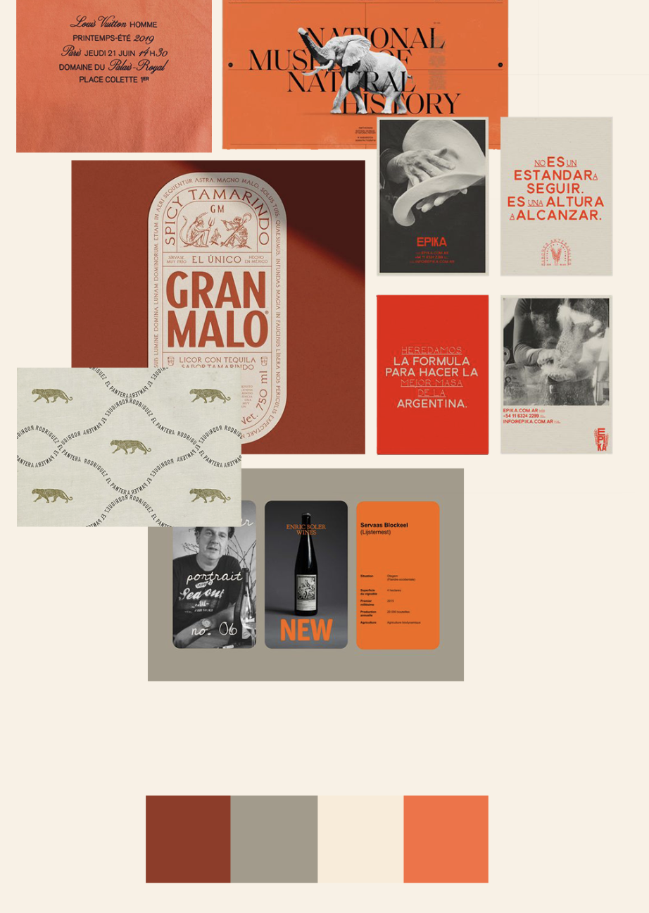
The process began with the creation of a mood board. This visual tool served as a collection of ideas, inspirations, and potential design elements. It included various logos, style elements, and color palettes that resonated with the brand's identity.
The initial Moodboards - nr 3
Core Values
The core values of Prtwine.com were incremental in shaping the design. These values include passion, knowledge, quality, rejuvenation, and storytelling. The logo needed to reflect these attributes while also appealing to the target audience - port wine enthusiasts of all ages.
The Elements
Choosing style elements was also an incremental part of our process.
In our design we choose these elements as they play a significant role in the portwine industry.
We have the following elements in our logo:
The Wine Glass.
The Keys of the Cellars
The Douro Valley
The Art-Deco elements from that Era.
The team at Brandbar Concepts also took into account the mission of Prtwine.com. The platform aims to provide comprehensive and relevant information about port wine production and history. It also seeks to connect wine lovers with top port producers and offer them a platform to share their passion and stories.
The logo design was also influenced by the founder's background. Ruud, an experienced entrepreneur with a deep-rooted interest in port wine, has dedicated his efforts to creating a platform that makes it easier for consumers to find the right port and enjoy this exclusive drink.

Our Color Pallet
Before choosing the final version logo we had to make a choice between 3 designs, that were a result of choosing our favorite moodboard. Because there were 2 moodboards that were in the race we couldn’t decide on what style we wanted more. These were the 2 options we like the most:
The final logo design is a reflection of Prtwine.com's commitment to rejuvenating the port sector and increasing knowledge about this drink. It symbolizes the platform's dedication to sharing the rich history and craftsmanship of aged and vintage port wines.
From left to right - We choose to use different key designs in the final result and not let the Douro river flow in the final design.
The logo is more than just a visual symbol; it's a representation of Prtwine.com's goals. These include creating a comprehensive port index website, offering a platform for producers to promote their products, and providing information about port in general.
The logo of Prtwine.com is a testament to the platform's dedication to its primary audience - the aged and vintage port wine lover. It also acknowledges the secondary audience, the port producers, and the tertiary audience, people looking for unique and exclusive gifts.